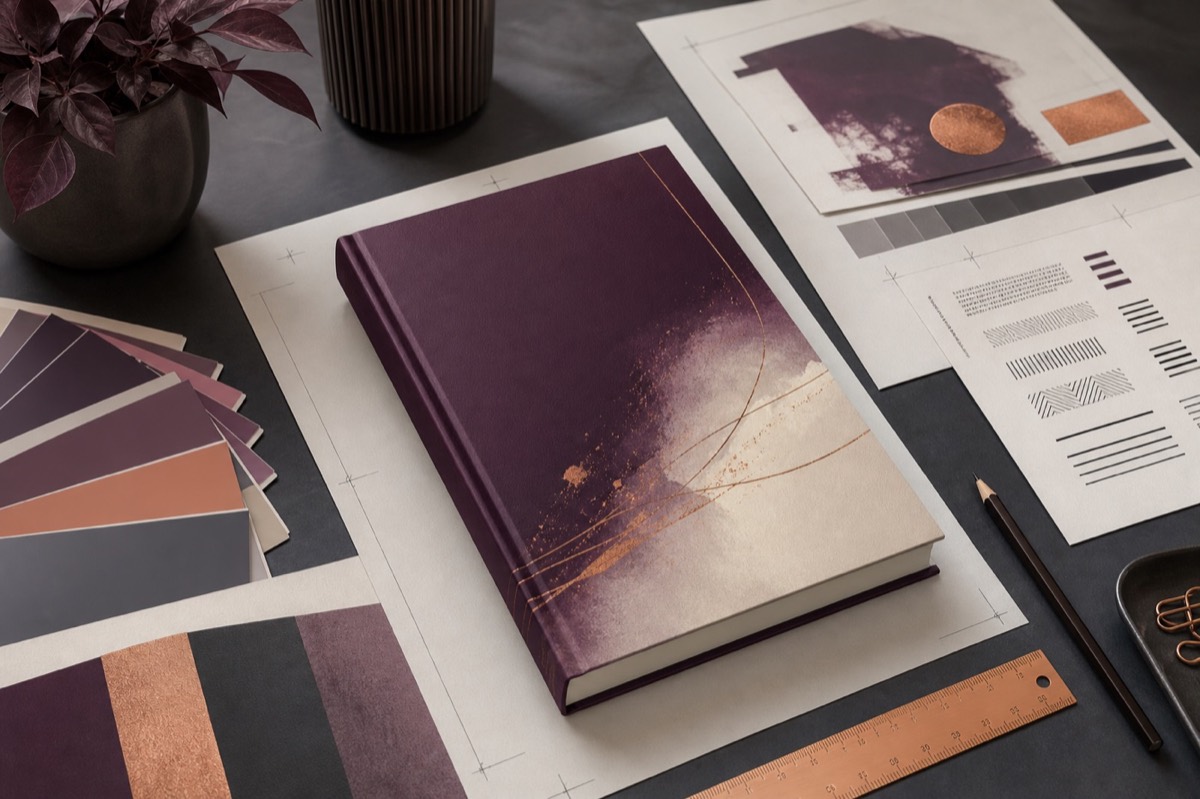
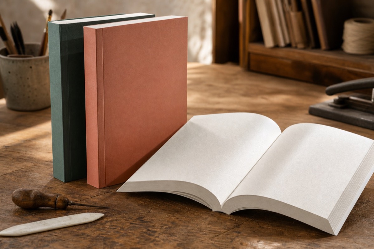
A paperback is a coordinated physical object, not simply a PDF placed between two flexible covers. Trim, paper, binding and typography affect one another. Making those decisions in the right order avoids repeated layout and cover work.
Choose trim by reader experience
Compare physical books in your category. A compact novel feels intimate; a larger non-fiction page can support diagrams and wider measures. Check which sizes your printer offers in each market and how the choice changes page count and manufacturing cost.
Allow for adhesive binding
Perfect-bound pages do not open completely flat. Increase the inner margin enough to keep text comfortable near the gutter, especially in thick books. A screen preview cannot reproduce binding resistance, so a physical proof remains essential.
Select paper before calculating the spine
Paper changes opacity, colour, thickness and reading mood. Cream stock is common in fiction; white stock may suit technical material and colour. The printer calculates spine width from final page count and selected paper. Never reuse an older cover template after pagination changes.
Design the interior as a system
Balance typeface, line length, leading, paragraph treatment and chapter openings. Inspect widows, orphans, headings and scene breaks. Print sample pages at 100 percent; a layout that looks generous on a large monitor can feel cramped in the hand.
Make production decisions in sequence
Select printer, trim, ink and paper before final layout. Complete pagination before calculating the cover. Upload only after interior and wrap agree. This order prevents a routine text change from creating repeated spine and template revisions.
Prepare a complete cover wrap
The print cover consists of back, spine, front and bleed. Protect important text from trim and fold zones. Use the provider's current template and the workflow in our cover-design guide.
Preflight before approval
- Trim dimensions match the selected product.
- Fonts are embedded and images have adequate effective resolution.
- Margins and gutters remain comfortable across the book.
- Blank pages, numbering and chapter starts are intentional.
- The cover uses final pagination and paper.
- A physical proof has been read, not merely photographed.
Review the proof from three perspectives
Read as a customer for comfort and visual confidence. Look as a bookseller for clear metadata, price and a usable spine. Inspect as a producer for trim, bleed, glue allowance and colour. Hold the proof beside comparable books and flip through it at normal speed; production faults often reveal themselves through use rather than close-up photography.
ManuBook connects book size, typography, margins, cover geometry and print export within one edition. If print on demand is your destination, continue with the Amazon KDP guide.
A trim decision changes the whole object
Keep the text constant and a smaller page usually creates more pages, a wider spine and different cost. A larger page may reduce extent but make a short novel feel sparse. Prototype representative spreads before committing. Readers experience line length, hand feel and weight together; a spreadsheet cannot select the format alone.

| Variable | Downstream effect | Evidence |
|---|---|---|
| Trim size | Page count, cost, category feel | Printed sample spreads |
| Stock | Opacity, spine, weight, warmth | Provider sample or proof |
| Type system | Reading comfort and extent | Ten-page reading test |
| Bleed | PDF size and safe area | Profile-specific preflight |
| Final extent | Cover geometry | Page count from approved PDF |
Minimum margin is not the same as generous typography
KDP's current guidance increases the inside margin as page count rises—for example 0.375 inch for 24–150 pages, 0.5 inch for 151–300 and 0.625 inch for 301–500. These are technical minimums. Your chosen font, binding behaviour and desired page colour may justify more space.